What makes a typeface look the way it does? The design of the letter shapes is a primary factor, but it’s by no means the only one. The spacing of a font has a large impact on how it looks when typeset, and should be taken into consideration when choosing and using a typeface.
Spacing
When we talk about a font’s spacing, or letter fit, we’re referring to the amount of space between the characters, which in turn gives the typeface its relative openness or tightness. The spacing of a particular font is initially determined by the manufacturer or designer and is somewhat size-dependent. Text designs tend to be spaced more openly than display faces. The reason for this? The smaller the point size, the more space is needed between letters to keep the characters legible. Conversely, as a typeface is set larger, a snugger fit between letters creates word-shapes that are easier to read.
Although spacing is dictated by personal taste as well as typographic trends (for example, seventies typefaces were fit more tightly than today’s fonts), the goal of good letter fit remains the same: to create even “color,” or visual texture, between all character combinations. It’s more difficult than it might seem, since the irregular shapes of many characters create some problematic letter combinations. This is where kerning comes to the rescue...
Kerning
Kerning refers to the adjustment of space between two specifi characters, thus the term kerning pair. Most often, kerning implies a reduction of space, but it can also mean the addition of space. Kern pairs are created to improve the spacing between two letters when the normal spacing is less than ideal. A perfect example is the spacing between a cap ‘A’ and ‘V.’ Typically, both ‘A’ and ‘V’ would be set so the terminals of their diagonal strokes nearly touch the vertical stroke in the adjacent letter, like an ‘H.’ When a ‘A’ and ‘V’ are set next to each other, however, the spacing looks too open. Kerning adjusts the spacing to be optically correct.
Most fonts have between two hundred and five hundred built-in kern pairs. A high-quality font may have over a thousand kern pairs. My font needs help! If you have a favorite font but the spacing or kerning leaves something to be desired, don’t despair: you can do something about it. Today’s robust design programs have advanced type handling features that can make vast improvements to your typography.
A AIGA aconselha isto, eu aconselho também ler os magníficos comentários sobre o assunto em questão
sexta-feira, 25 de fevereiro de 2011


quarta-feira, 23 de fevereiro de 2011
A Magazine Is Born - the making of Little White Lies
Achei este video muito interessante pela forma como mostra todo o processo de criação da revista.
Acho que no fundo todos nos revemos de alguma forma!
terça-feira, 22 de fevereiro de 2011
Guimarães 2012


/ vídeo de apresentação da marca
Marca "Guimarães 2012 - Capital Europeia da Cultura" criada por antigo aluno da Universidade de Aveiro
A imagem gráfica de «Guimarães 2012 – Capital Europeia da Cultura» é da autoria do antigo aluno de Design da UA, João Campos.
A marca, com 26 variações distintas, é baseada nas muralhas da cidade e explora a ideia de diversidade cultural, valorização individual e abertura à multiplicidade de visões pessoais.O símbolo desenvolvido «agrega alegoricamente a muralha em representação do Património da Humanidade presente em Guimarães, o desenho da viseira de um elmo que presta homenagem à visão de D. Afonso Henriques, a proeminente figura da fundação de Portugal e é rematado sob a forma de um coração, em evocação plena do orgulho e sentimento vivo de pertença dos vimaranenses em relação à sua cidade», explica João Campos.
São 26 modelos diferentes que têm na sua base o legado histórico da cidade de Guimarães, no entanto, também pretende ter um olhar para o futuro e para a diversidade cultural, «uma janela aberta a cada visão pessoal ou uma tela em branco para qualquer expressão individual», afirma o designer. As linhas do logótipo têm como objectivo ultrapassar a esfera criativa interna à organização do evento. João Campos refere que é um conceito «com alto potencial de personalização, o apelo à participação, envolvimento e, por fim, à apropriação da marca é dirigido a todo e qualquer cidadão europeu». /artigo completo
/guimaraes2012.pt
/xiistudios.com - o portfolio online de João Campos. é possível fazer download de mais informação em pdf, e ver outros trabalhos do senhor !
domingo, 20 de fevereiro de 2011

googleartproject.com
Explore museums from around the world, discover and view hundreds of artworks at incredible zoom levels, and even create and share your own collection of masterpieces.
http://www.googleartproject.com/
http://www.youtube.com/googleartproject
http://www.googleartproject.com/
http://www.youtube.com/googleartproject
sábado, 19 de fevereiro de 2011
FIELDS
Immaterials: the ghost in the field from timo on Vimeo
a beleza do que nos acompanha todos os dias sem percebermos que eles de facto nos acompanham
quinta-feira, 17 de fevereiro de 2011
What is Watson?
O Watson é um supercomputador da IBM que foi preparado para jogar Jeopardy - um jogo de perguntas muito popular na televisão norte-americana. Mas para aparecer na televisão... é preciso aparecer.
O problema de representar visualmente um computador e as suas "emoções" foi apresentado ao designer Joshua Davis, que resolveu a questão inspirando-se directamente no logótipo da Smarter Planet - uma plataforma de troca de ideias sobre sustentabilidade e tecnologias, iniciativa da IBM -; os Automata Studios trataram da implementação.
Como o Watson possui algoritmos muito complexos que lhe permitem exprimir e medir diferentes coisas, havia também a necessidade de criar algo que conseguisse transmitir esses diferentes "estados de espírito" dinamicamente. Mas não vale a pena explicar muito mais, o vídeo conta muito bem esta história (:
Your Mom Hates Dead Space 2
Para quem perdeu a diversão no início da aula de hoje.
Normalmente numa campanha de marketing a última coisa que queremos é chamar ao nosso produto "horrível" e mostrar como as pessoas não gostaram dele. Excepto se essas pessoas forem as nossas mães e alguém gravar a cara de desaprovação e horror delas para a posteridade.
O Behind The Scenes explica como se desenrolaram as filmagens (e tem cenas imperdíveis, confiem em mim :P):
o vídeo de campanha aqui, mais mães assustadas aqui, aqui e uma mãe que claramente pertence à máfia mexicana
Normalmente numa campanha de marketing a última coisa que queremos é chamar ao nosso produto "horrível" e mostrar como as pessoas não gostaram dele. Excepto se essas pessoas forem as nossas mães e alguém gravar a cara de desaprovação e horror delas para a posteridade.
O Behind The Scenes explica como se desenrolaram as filmagens (e tem cenas imperdíveis, confiem em mim :P):
o vídeo de campanha aqui, mais mães assustadas aqui, aqui e uma mãe que claramente pertence à máfia mexicana
quarta-feira, 16 de fevereiro de 2011
Dynamic identity for Converge
We recently worked on the identity for ‘Converge’, a series of events exploring this emerging crossover between photography, film making and CG. It was an unusual project for us in the sense that we only developed and delivered the central mark – a converg ing, dynamic RGB arrangement that can be seen as either a 2D graphic or 3D ‘cubes’ – and suggestion for accompanying typography – before the outcome left our studio and influence.
Read more: http://zerofee.org/goodthinking/index.php/2010/01/converge/
segunda-feira, 14 de fevereiro de 2011
Dezeen Watch Store
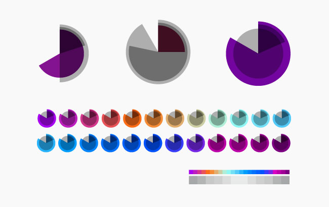
As the symbol moves through 86,400 different combinations of shape and colour, abstractly representing local time in 24 hour format, the identity becomes a timepiece itself while always remaining recognisable. The outer grey circle is slightly darker in winter, lighter in summer; the hours and minutes are represented by incomplete circles with consistent radii that approach 360º over a period of 24 hours and 60 minutes respectively. Seconds are represented by a complete circle that radiates from the centre of the symbol, increasing its diameter in 60 stages until resetting to zero each minute. The hour shape changes colour 24 times a day.
sábado, 12 de fevereiro de 2011
Naomi Klein on how corporate branding has taken over America
Ten years after the publication of No Logo, Naomi Klein switches her attention from the mall to Barack Obama and discovers that corporate culture has taken over the US government.


In May 2009, Absolut Vodka launched a limited edition line called "Absolut No Label". The company's global public relations manager, Kristina Hagbard, explained that "For the first time we dare to face the world completely naked. We launch a bottle with no label and no logo, to manifest the idea that no matter what's on the outside, it's the inside that really matters."
A few months later, Starbucks opened its first unbranded coffee shop in Seattle, called 15th Avenue E Coffee and Tea. This "stealth Starbucks" (as the anomalous outlet immediately became known) was decorated with "one-of-a-kind" fixtures and customers were invited to bring in their own music for the stereo system as well as their own pet social causes – all to help develop what the company called "a community personality." Customers had to look hard to find the small print on the menus: "inspired by Starbucks". Tim Pfeiffer, a Starbucks senior vice-president, explained that unlike the ordinary Starbucks outlet that used to occupy the same piece of retail space, "This one is definitely a little neighbourhood coffee shop." After spending two decades blasting its logo on to 16,000 stores worldwide, Starbucks was now trying to escape its own brand.
Continua at http://www.guardian.co.uk/books/2010/jan/16/naomi-klein-branding-obama-america/print
Logo Design Gone Wrong: 10 Offbeat Example
http://www.hongkiat.com/blog/logo-design-gone-wrong/
 While the implementation of an effective logo can set a company up for success, the opposite is also possible. When outside input isn’t gathered to evaluate logo prototypes, designers can miss major steps and the result can be disastrous.

Subscrever:
Mensagens (Atom)