http://www.underconsideration.com/brandnew/archives/a_more_royal_royal_opera_house.php
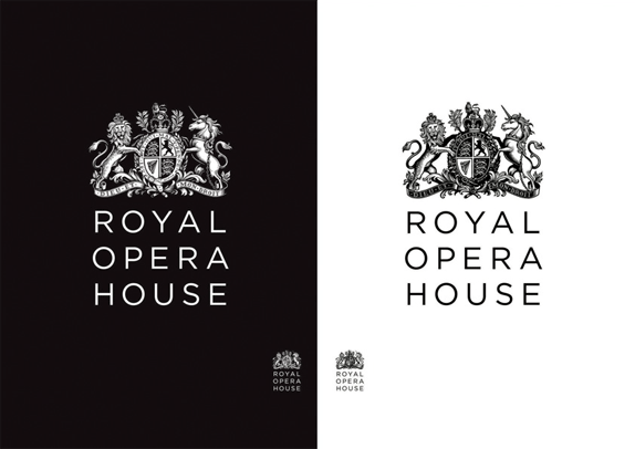
It goes without saying that the new crest is simply fantastic and I’m not one to easily compliment crests. The previous lion and unicorn looked as if Bambi had eaten their families and had nothing but droopy, sad eyes to show for it. The updated versions are proud and strong. And probably ate Bambi. My favorite aspect of it is that they created two versions, positive and negative, to use on light and dark backgrounds — instead of just inverting the positive version, as the old one did.
