Mostrar mensagens com a etiqueta logo. Mostrar todas as mensagens
segunda-feira, 4 de julho de 2011
Museum of the Moving Image
http://www.underconsideration.com/brandnew/archives/forward-looking_image.php
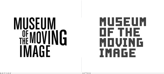
The typeface, designed by Cologne-based Julius Terlinden that creates the Museum’s logotype was drawn on a triangular grid inspired by the Museum’s new façade. As the core identity element, it seems fitting. The new building’s architecture is so memorable, so why fight it? It manages to evoke the golden era of cinema while looking curiously futuristic. It also has a remarkable Saul Bass quality. The typeface is not only used to create the logotype, but employed as a central messaging platform within the museum on signage and used in print materials.
quarta-feira, 8 de junho de 2011
Someone's explosive identity for Resonate
Creative Review - Someone's explosive identity for Resonate
http://www.someoneinlondon.com/category/projects/resonate-one-idea-a-million-stories
This way they can ensure everything joins up and the big ideas created for brands are designed in a way that can be best communicated to the specific desired audiences.
We took the metaphor of a beautiful flower to signify these big ideas. Then applied shockwaves to them after they were frozen in liquid nitrogen.
These shockwaves resonated through the frozen plants and shattered them, into a million pieces (we didn’t count, but we we think it was close to at least million!)
Outros projectos:
http://www.someoneinlondon.com/category/projects/eurostar-sculpted-brand-thinking
http://www.someoneinlondon.com/category/projects/nma-opening-up-newspapers
http://www.someoneinlondon.com/category/projects/wi-tribe-broadband-re-imagined
http://www.someoneinlondon.com/category/projects/resonate-one-idea-a-million-stories
This way they can ensure everything joins up and the big ideas created for brands are designed in a way that can be best communicated to the specific desired audiences.
We took the metaphor of a beautiful flower to signify these big ideas. Then applied shockwaves to them after they were frozen in liquid nitrogen.
These shockwaves resonated through the frozen plants and shattered them, into a million pieces (we didn’t count, but we we think it was close to at least million!)
Outros projectos:
http://www.someoneinlondon.com/category/projects/eurostar-sculpted-brand-thinking
http://www.someoneinlondon.com/category/projects/nma-opening-up-newspapers
http://www.someoneinlondon.com/category/projects/wi-tribe-broadband-re-imagined
quarta-feira, 4 de maio de 2011
segunda-feira, 2 de maio de 2011
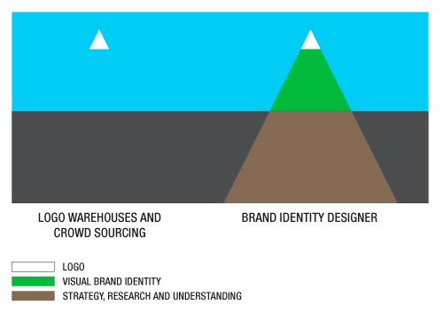
Logo warehouses, crowdsourcing, and a lack of understanding
A graphic designer must provide a bridge of understanding between a company and its audience. They must ask the right questions, pushing the client for authenticity. They must then validate the responses, making sure there are no gaps in understanding or differences in thinking. They must provide direction and guidance built on strategy.
http://www.logodesignlove.com/logo-warehouses-and-crowdsourcing
quarta-feira, 20 de abril de 2011
Planes, trains, and logo-inspired art
johnson banks’ creative director Michael Johnson was interviewed about the challenges faced when designing aircraft liveries and logos. “You might have the best idea for a fantastically unusual tailfin symbol, but stitched on a badge, or a uniform, or screen-printed in one colour onto a catering pack it falls apart. So infinite flexibility is now the watchword.” A worthwhile read.
http://www.logodesignlove.com/virgin-livery-eurostar-branding?utm_source=feedburner&utm_medium=feed&utm_campaign=Feed%3A+logodesignlove+%28Logo+Design+Love%29&utm_content=Google+Reader
terça-feira, 5 de abril de 2011
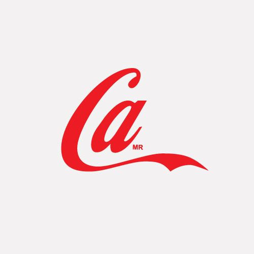
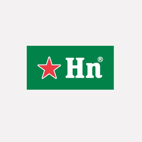
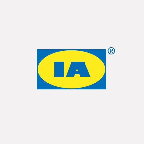
Shortened logos
When a logo is seen often enough, it can be simplified yet still identify its owner.
quarta-feira, 16 de março de 2011
Augmented Reality Get Its Own Standardized Logo
"With the new AR+ logo, the industry can give consumers, developers, brands, and others a consistent framework for encountering and understanding augmented reality solutions," said Uzzan in a press release Thursday. "There's a sense that the AR industry has grown up too fast, that it has at times felt like the 'Wild West.' Today, the industry consists of multiple players, multiple platforms and easier access to AR. The new AR+ logo affirms that we're working with a new human interface, now going mainstream."
More at http://www.readwriteweb.com/archives/augmented_reality_gets_its_own_standardized_logo.php
quinta-feira, 10 de março de 2011
ITI
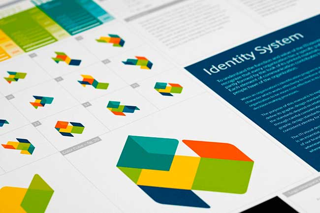
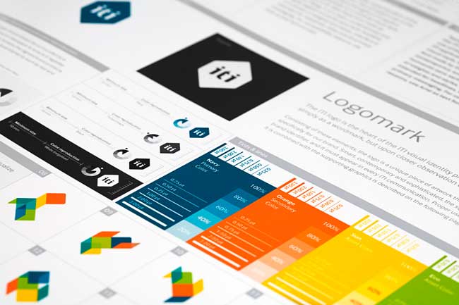
ITI is a pioneer in automation technology, solving everyday challenges in all parts of life. With a clear strategic focus, ITI is making better life-quality everywhere — in private life, corporate buildings, public space and healthcare. The brand communication Heydays developed for ITI is built upon the business idea itself. Making everyday tasks easier for everyone, ITI’s visual program is summarized in the slogan “Room for life.”
The logo can be seen as just a flat artwork, but can also be seen as a cube felt with colors. The multicolored supporting graphic illustrates the logo folded out, and comes in a number of different versions. This communicates both the adaptability of the system, and life taking different directions. Appearing different on every surface, the visual expression is a representation of life, freedom and possibilities. The color palette is optimistic and brings energy to the brand. Heydays established their core values and developed a full visual identity program and slogan.
More at http://identitydesigned.com/iti/
ITI from Heydays on Vimeo.
sexta-feira, 25 de fevereiro de 2011
quarta-feira, 16 de fevereiro de 2011
Dynamic identity for Converge
We recently worked on the identity for ‘Converge’, a series of events exploring this emerging crossover between photography, film making and CG. It was an unusual project for us in the sense that we only developed and delivered the central mark – a converg ing, dynamic RGB arrangement that can be seen as either a 2D graphic or 3D ‘cubes’ – and suggestion for accompanying typography – before the outcome left our studio and influence.
Read more: http://zerofee.org/goodthinking/index.php/2010/01/converge/
segunda-feira, 14 de fevereiro de 2011
Dezeen Watch Store
http://identitydesigned.com/dezeen-watch-store/
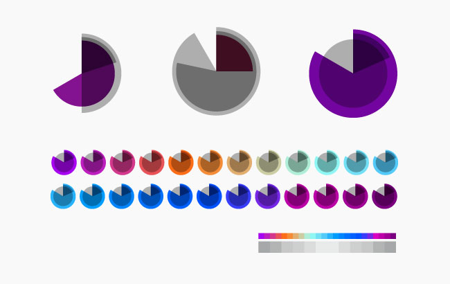
As the symbol moves through 86,400 different combinations of shape and colour, abstractly representing local time in 24 hour format, the identity becomes a timepiece itself while always remaining recognisable. The outer grey circle is slightly darker in winter, lighter in summer; the hours and minutes are represented by incomplete circles with consistent radii that approach 360º over a period of 24 hours and 60 minutes respectively. Seconds are represented by a complete circle that radiates from the centre of the symbol, increasing its diameter in 60 stages until resetting to zero each minute. The hour shape changes colour 24 times a day.
sábado, 12 de fevereiro de 2011
Naomi Klein on how corporate branding has taken over America
Ten years after the publication of No Logo, Naomi Klein switches her attention from the mall to Barack Obama and discovers that corporate culture has taken over the US government.
In May 2009, Absolut Vodka launched a limited edition line called "Absolut No Label". The company's global public relations manager, Kristina Hagbard, explained that "For the first time we dare to face the world completely naked. We launch a bottle with no label and no logo, to manifest the idea that no matter what's on the outside, it's the inside that really matters."
A few months later, Starbucks opened its first unbranded coffee shop in Seattle, called 15th Avenue E Coffee and Tea. This "stealth Starbucks" (as the anomalous outlet immediately became known) was decorated with "one-of-a-kind" fixtures and customers were invited to bring in their own music for the stereo system as well as their own pet social causes – all to help develop what the company called "a community personality." Customers had to look hard to find the small print on the menus: "inspired by Starbucks". Tim Pfeiffer, a Starbucks senior vice-president, explained that unlike the ordinary Starbucks outlet that used to occupy the same piece of retail space, "This one is definitely a little neighbourhood coffee shop." After spending two decades blasting its logo on to 16,000 stores worldwide, Starbucks was now trying to escape its own brand.
Continua at http://www.guardian.co.uk/books/2010/jan/16/naomi-klein-branding-obama-america/print
Logo Design Gone Wrong: 10 Offbeat Example
http://www.hongkiat.com/blog/logo-design-gone-wrong/
While the implementation of an effective logo can set a company up for success, the opposite is also possible. When outside input isn’t gathered to evaluate logo prototypes, designers can miss major steps and the result can be disastrous.
quarta-feira, 19 de janeiro de 2011
there's something magnificent about Google's lack of design
"And yet, I think there's something magnificent about Google's lack of design. There's something defiant, almost obtuse about its reluctance to indulge in the sort of oleaginous branding and design that is now the corporate norm. We've reached a point, in the homogenized West, where good graphic design is everywhere. The battle has been won: every business knows it needs good design —you don't have to tell them anymore. It's enshrined in the business schools, established in the corporate HQs. Even small businesses understand that good design is good for business. It's a universal truth, like "customer service" and "value for money," and all the other boardroom nostrums that drive modern commerce.
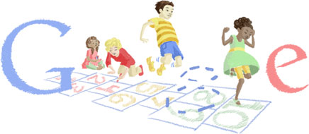
But the consequence of all this feel-good business is that design has become, more often than not, a badge of mediocrity. The old Modernist dream of good design standing for rationality and human values has been flipped. Today, good design is little more than a cosmetic agent, an obscuring agent. When I see my favorite sandwich bar introduce a slick new fascia and smart window decals, a little wave of disappointment runs through me. You don't see the work of sign writers any more; it's hard to find handmade signs and ramshackle window displays. The urban environment is now over-designed. It's all too branded, too inhuman. "
O artigo do Design Observatory de onde retirei esta citação tem uns aninhos [ 03.12.06, Adrian Shaughnessy, Google and the Tyranny of Good Design] mas acho que é uma boa reflexão sobre um mundo demasiado projectado que pode afastar-nos por ser desumano. Projectar para as pessoas e não pelo "dzgn-erish" da coisa, aceitar que podemos não ter de controlar tão friamente tudo, para que exista participação e envolvimento.
But the consequence of all this feel-good business is that design has become, more often than not, a badge of mediocrity. The old Modernist dream of good design standing for rationality and human values has been flipped. Today, good design is little more than a cosmetic agent, an obscuring agent. When I see my favorite sandwich bar introduce a slick new fascia and smart window decals, a little wave of disappointment runs through me. You don't see the work of sign writers any more; it's hard to find handmade signs and ramshackle window displays. The urban environment is now over-designed. It's all too branded, too inhuman. "
O artigo do Design Observatory de onde retirei esta citação tem uns aninhos [ 03.12.06, Adrian Shaughnessy, Google and the Tyranny of Good Design] mas acho que é uma boa reflexão sobre um mundo demasiado projectado que pode afastar-nos por ser desumano. Projectar para as pessoas e não pelo "dzgn-erish" da coisa, aceitar que podemos não ter de controlar tão friamente tudo, para que exista participação e envolvimento.
segunda-feira, 17 de janeiro de 2011
Visit Nordkyn
http://www.underconsideration.com/brandnew/archives/where_the_cold_wind_blows.php
The visual identity is based on two main ingredients; our newly developed payoff, “Where nature rules,” and weather statistics from the Norwegian Meteorological Institute. A feed of weather statistics affects the logo to change when the direction of the wind or the temperature changes. On the website, the logo updates every five minutes. We developed a logo generator where Visit Nordkyn can download their logo to the exact weather conditions of that particular moment. Nordkyn is truly a place where nature rules, even over the visual identity.
Neue Project Description
domingo, 2 de janeiro de 2011
A More Royal Royal Opera House
http://www.underconsideration.com/brandnew/archives/a_more_royal_royal_opera_house.php
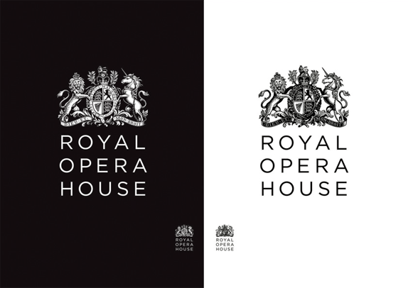
It goes without saying that the new crest is simply fantastic and I’m not one to easily compliment crests. The previous lion and unicorn looked as if Bambi had eaten their families and had nothing but droopy, sad eyes to show for it. The updated versions are proud and strong. And probably ate Bambi. My favorite aspect of it is that they created two versions, positive and negative, to use on light and dark backgrounds — instead of just inverting the positive version, as the old one did.
terça-feira, 28 de dezembro de 2010
Sketches
Showing sketches to clients
http://www.davidairey.com/showing-sketches-to-clients/
Offsetters
http://identitydesigned.com/offsetters/
http://www.davidairey.com/showing-sketches-to-clients/
Offsetters
http://identitydesigned.com/offsetters/
quarta-feira, 15 de dezembro de 2010
Alguns logos
- http://www.davidairey.com/aspect-46-brand-identity-design/
- http://www.davidairey.com/ecometrica-logo-design-process/
- http://www.davidairey.com/logo-design-for-giacom/
- http://www.davidairey.com/ingalls-logo-design-process/
- http://www.davidairey.com/vissumo-logo-design-process/
- http://www.davidairey.com/henri-ehrhart-logo-design-process/
similar-original-logos, negative-space-logo-design, 10-successful-logo-redesigns, 15-wonderfully-simple-logo-designs, ambigram-logos
http://www.logodesignlove.com/similar-original-logos
http://www.logodesignlove.com/negative-space-logo-design
http://www.logodesignlove.com/10-successful-logo-redesigns
http://www.logodesignlove.com/15-wonderfully-simple-logo-designs
http://www.logodesignlove.com/ambigram-logos
http://www.logodesignlove.com/negative-space-logo-design
http://www.logodesignlove.com/10-successful-logo-redesigns
http://www.logodesignlove.com/15-wonderfully-simple-logo-designs
http://www.logodesignlove.com/ambigram-logos
Etiquetas:
ambigram,
logo,
negativeSpace,
redesign,
similar
Subscrever:
Mensagens (Atom)