O enunciado da proposta de trabalho 3.2 iniciada na semana passada já se encontra online.
http://designdois.blogspot.com/p/propostas-de-trabalho.html
segunda-feira, 17 de janeiro de 2011

Manual de identidade da UP
O manual de identidade da Universidade do Porto encontrado pela vossa colega Carla Serra.
http://hestia.up.pt/manualUP/index.php.
http://hestia.up.pt/manualUP/index.php.
segunda-feira, 10 de janeiro de 2011
Change +: Leslie Witt, “The Illusion of Neutrality”
"In design there is no neutrality. You're either help to create the problem or contributing to the solution."
Change +: Leslie Witt, “The Illusion of Neutrality” from IDEO on Vimeo.
"As credit cards are increasingly vilified - treated as a disease, demanding abstention - the question must be asked - ‘how did something so neutral become so polarized?’. We believe that it’s this neutrality, or illusion of neutrality, which is at the heart of the problem. The illusion of neutrality and the lack of personal control which is it’s bedfellow, isn’t unique to credit cards, nor to the financial service industry. From big box retailers who see themselves as simply the bridge from supplier to purchaser, to utility companies who envision their service as one of pipes and nodes - a sense of identity as infrastructure allows industries to avoid implication in the range of unhealthy and unsustainable behaviors that permeate our now. You can’t be Switzerland in this battle, and it’s important to pick which side you’re on. Design can help you step out of the shadow of neutrality and tread into the choppy waters of behavior change."
Change +: Leslie Witt, “The Illusion of Neutrality” from IDEO on Vimeo.
"As credit cards are increasingly vilified - treated as a disease, demanding abstention - the question must be asked - ‘how did something so neutral become so polarized?’. We believe that it’s this neutrality, or illusion of neutrality, which is at the heart of the problem. The illusion of neutrality and the lack of personal control which is it’s bedfellow, isn’t unique to credit cards, nor to the financial service industry. From big box retailers who see themselves as simply the bridge from supplier to purchaser, to utility companies who envision their service as one of pipes and nodes - a sense of identity as infrastructure allows industries to avoid implication in the range of unhealthy and unsustainable behaviors that permeate our now. You can’t be Switzerland in this battle, and it’s important to pick which side you’re on. Design can help you step out of the shadow of neutrality and tread into the choppy waters of behavior change."
domingo, 9 de janeiro de 2011
Brands of the future
"As brands become less the property of an organisation and more the banner of a movement, ownership will become even looser. Logos will be things other organisations, and individuals, can borrow and adapt."
http://www.wolffolins.com/brandnext/
http://www.wolffolins.com/brandnext/
sexta-feira, 7 de janeiro de 2011
("I COOK FOR YOU") - a nova panela de pressão do design

—desculpem a quantidade de texto, mas leiam—
"(…)The balancing of understanding and overbearing clients is nothing new, but at least that client/designer relationship still exists. Only a few months ago a new service Ready Media pitched up online, which allows companies to create their own magazines using a set of pre-designed templates. This is something that has existed for a long time for websites, but relatively new to editorial publishing. Opening with the inflammatory phrase ‘just add content’, it conjures up images of picking out a packet of cake mix, and simply adding water, stirring, and throwing it in the oven. It may be standard practice for design agencies to create templates for new or relaunched magazines, and then passed onto the in-house art department, but these templates are built for that particular magazine; its audience, its content, the art direction and the flow of the articles. The danger of removing the designer from the process and allowing the client to directly pick out a pre-designed template is it may not suit the content or audience. Ready Media does offer to adapt templates for an extra fee, so as a business idea it’s perfect for getting clients through the door and selling them something more ‘bespoke’. However, it causes many designers, including myself, to feel quite uncomfortable. It makes our job appear easy, like simply picking out a new set of curtains, our only function is mere decoration. It devalues the role that the designer plays in the process.
If the template services are widely adopted by the industry, it may only be bad news for designers that use the same style over and over again for each client. Inevitably they will be imitated or absorbed by the companies offering a template of a similar style at a fraction of the price. This will force some designers to try harder, to outrun the imitators. My concern is the designer becomes an expensive luxury that can be removed from the formula. This may not worry the agencies with large clients with large pockets, but for the companies that rely on a steady flow of lower budget work this could seriously affect their survival.
The template model may cause editorial designers to shift uneasily in their seats, but branding designers may also worry a little about the outsourcing/crowdsourcing model made possible by faster and wider global internet access. Some companies offer an ‘affordable’ and speedy logo outsourced to countries where the labour is cheaper. Others offer the crowdsourcing model, where a cluster of desperate enthusiastic designers spit out many variations of the client’s logo, until a lucky one wins the measly prize. Essentially this is a marriage of convenience; the client will get exactly what they pay for; an ill-conceived design, based on a sparse brief and no expensive surprises, and the designer gets paid for a few hours work. Everyone’s a winner.
The budget logo companies draw inevitable comparisons with the fashion industry. From employing cheap overseas labour for the benefit of rich Western countries, to the cheap but formulaic styles that spread like wildfire. Budget high street fashion stores are regularly ‘inspired’ by the designs that appear on the high fashion catwalks, with the budget logo designers they too absorb the styles of the designers at the top.
To survive as a designer (without losing your soul) does that mean we have to become the equivalent of a Saville Row tailors? Essentially yes, with a tailor you pay for the personalised customer service, for an outfit that not only fits and flatters you, it fits your personality. So as designers we have to maintain that level of service, listening to the client, creating something unique to them and risk surprising them with something they were not expecting. All of these qualities are impossible to conduct with a quick and cheap logo service, or a window display of templates. For the client who appreciates these differences, they be willing to pay the extra to communicate their message and personality effectively."
será que isto é considerado design, ou algo que podemos comprar no supermercado?
quarta-feira, 5 de janeiro de 2011
"Less, but better", Dieter Rams e a Apple
"Pablo Picasso once said Good Artists Copy, Great Artists Steal then Steve Jobs mention that in one interview long ago. We all know that Apple products are the best out there, there's no doubt about it, and the main reason about that is because they have the best design.
Jonhathan Ive, the chief industrial designer at Apple is a fantastic designer but it's always good to know what and who inspired him to come up with the Apple product designs. We might think that they are pretty unique and new but when we look at Dieter Rams the Pablo Picasso's quote makes even more sense."

Rams' ten principles to "good design"
- is innovative
- makes a product useful
- is aesthetic
- makes a product understandable
- is unobtrusive
- is honest
- is long-lasting
- is thorough down to the last detail
- is environmentally friendly
- is as little design as possible
mais aqui: http://abduzeedo.com/design-history-diert-rams-less-better

terça-feira, 4 de janeiro de 2011
Rio 2016

Holding Hands in Rio
http://www.underconsideration.com/brandnew/archives/holding_hands_in_rio.php
Rio 2016: Another Olympic logo. Another controversy
http://www.thelogofactory.com/logo_blog/index.php/rio-201-olympic-logo/
Rio 2016 logo
http://www.logodesignlove.com/rio-2016-logo?utm_source=feedburner&utm_medium=feed&utm_campaign=Feed%3A+logodesignlove+%28Logo+Design+Love%29&utm_content=Google+Reader
segunda-feira, 3 de janeiro de 2011
Comic Sans e Dislexia
Eu sei que para muitos o ideal seria que este post demonstrasse que a Comic Sans é tão má que até nos põe disléxicos - mas não é. Na verdade, segundo o dyslexic.com
Mas para além desta, o site avança com uma série de outros exemplos de fonts que proporcionam uma melhora leitura a passoas com este problema, algumas delas projectadas especificamente com esse fim. A Read Regular é uma delas e numa pesquisa sobre este tema encontrei também a Delicious, discutida aqui (já agora, a Delicious vem da foundry exljbris, os criadores da Museo, distribuída gratuitamente pela fontshop).


Provavelmente já conseguiram ver algumas similaridades entre estas duas últimas, uma vez que ambos os designers tiveram o cuidado de diferenciar cada caracter, p.ex. não espelhando os dpbq, mas tornando cada um único, entre outros pormenores que facilitam a identificação de cada letra.
Da próxima vez que quiserem atirar coisas pelo ar porque avistaram a Comic Sans enfiada noutro cartaz/cartão pessoal/flyer/coisa, lembrem-se que ela pode estar a ajudar alguém... ou não, podem continuar a pensar que podia estar ali a ser usada uma outra font, que devido às suas características, tamanho e espacejamento, poderia providenciar todo o conforto de leitura e uma melhor imagem/sentimento ao material.
O importante era alertar para este problema que se relaciona directamente com um dos pilares da nossa disciplina e que se torna especialmente relevante quando pensarmos que o design deverá chegar a todo o público pretendido, ultrapassando e resolvendo os problemas que possa encontrar pelo caminho. A dislexia é um ponto especialmente a ter em conta ao projectar material para crianças que estejam ainda a aprender a ler e a escrever.
Se virem esses sites e fizerem uma pesquisa rápida sobre a dislexia - até pela wikipedia - ficam com uma noção das principais dificuldades e preferências de quem é disléxico.
Some dyslexic people find that Comic Sans is one of the more readable of the commonly-available Windows fonts, and we have used it on this web site in the past. Others find it too bold, too childish or too informal.
Mas para além desta, o site avança com uma série de outros exemplos de fonts que proporcionam uma melhora leitura a passoas com este problema, algumas delas projectadas especificamente com esse fim. A Read Regular é uma delas e numa pesquisa sobre este tema encontrei também a Delicious, discutida aqui (já agora, a Delicious vem da foundry exljbris, os criadores da Museo, distribuída gratuitamente pela fontshop).


Provavelmente já conseguiram ver algumas similaridades entre estas duas últimas, uma vez que ambos os designers tiveram o cuidado de diferenciar cada caracter, p.ex. não espelhando os dpbq, mas tornando cada um único, entre outros pormenores que facilitam a identificação de cada letra.
Da próxima vez que quiserem atirar coisas pelo ar porque avistaram a Comic Sans enfiada noutro cartaz/cartão pessoal/flyer/coisa, lembrem-se que ela pode estar a ajudar alguém... ou não, podem continuar a pensar que podia estar ali a ser usada uma outra font, que devido às suas características, tamanho e espacejamento, poderia providenciar todo o conforto de leitura e uma melhor imagem/sentimento ao material.
O importante era alertar para este problema que se relaciona directamente com um dos pilares da nossa disciplina e que se torna especialmente relevante quando pensarmos que o design deverá chegar a todo o público pretendido, ultrapassando e resolvendo os problemas que possa encontrar pelo caminho. A dislexia é um ponto especialmente a ter em conta ao projectar material para crianças que estejam ainda a aprender a ler e a escrever.
Se virem esses sites e fizerem uma pesquisa rápida sobre a dislexia - até pela wikipedia - ficam com uma noção das principais dificuldades e preferências de quem é disléxico.
domingo, 2 de janeiro de 2011
A More Royal Royal Opera House
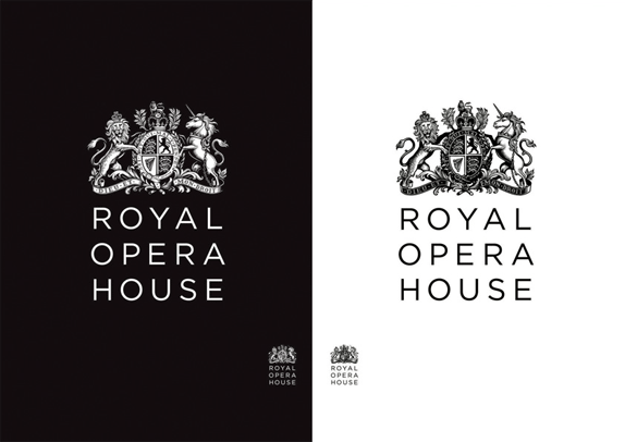
http://www.underconsideration.com/brandnew/archives/a_more_royal_royal_opera_house.php
It goes without saying that the new crest is simply fantastic and I’m not one to easily compliment crests. The previous lion and unicorn looked as if Bambi had eaten their families and had nothing but droopy, sad eyes to show for it. The updated versions are proud and strong. And probably ate Bambi. My favorite aspect of it is that they created two versions, positive and negative, to use on light and dark backgrounds — instead of just inverting the positive version, as the old one did.

Subscrever:
Mensagens (Atom)