Aqui está uma parte da identidade corporativa em que dificilmente trabalharemos durante as nossas vidas.
T-Mobile
Mercedes (este é particularmente fantástico)
Nokia
XBox
Disney
20th Century Fox
Intel
THX
quinta-feira, 27 de janeiro de 2011

quarta-feira, 26 de janeiro de 2011

terça-feira, 25 de janeiro de 2011
Nota importante
Serve a presente nota para comunicar que os projectos que não se encontrem publicados nos blogues dos respectivos discentes serão considerados como não realizados e tidos em conta no que diz respeito à avaliação de desempenho do aluno. Sendo que terão assim uma cotação de zero valores. Todos os projectos publicados nos blogues deverão ser acompanhados da respectiva memória descritiva que foi solicitada para a sua apresentação. As imagens e vídeos publicados deverão ter uma resolução suficientemente elevada de modo a que a sua fruição não seja prejudicada e o trabalho mantenha a sua dignidade e integridade.
Relembra-se que os referidos blogues deverão estar organizados de modo a facilitar a sua consulta, sendo que todos os projectos deverão estar devidamente identificados.
Qualquer problema deverá ser comunicado atempadamente.
Todos os projectos deverão ser publicados até ao fim do dia 27 de Janeiro de 2011, quinta-feira.
Relembra-se que os referidos blogues deverão estar organizados de modo a facilitar a sua consulta, sendo que todos os projectos deverão estar devidamente identificados.
Qualquer problema deverá ser comunicado atempadamente.
Todos os projectos deverão ser publicados até ao fim do dia 27 de Janeiro de 2011, quinta-feira.
segunda-feira, 24 de janeiro de 2011
Convert CMYK swatches to Pantone numbers in Illustrator
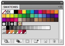
Convert CMYK swatches to Pantone numbers in Illustrator—http://font.is/?p=1293
Converting colors between color systems is a never ending story for designers. Much of the converting can be done by the method described in a previous article on this site. There is one conversion not possible there, one that most designers are not aware of how to do easily: How to find what Pantone color best matches their CMYK matches.
Converting colors between different color systems—http://font.is/?p=1277
Converting RGB colors to CMYK for printing purposes or Color Management, is some thing we designer have to deal with almost every day. It’s easy to get information about Color Management in books and on the web. I am not going to go through that here but con cen trate on other less com mon conversions.
sábado, 22 de janeiro de 2011
On Simplicity
Versões para download e em alta resolução assim como o Interactive Transcript at http://www.ted.com/talks/john_maeda_on_the_simple_life.html
quinta-feira, 20 de janeiro de 2011
um conselho de amiga.

http://www.goodfuckingdesignadvice.com
(se não qiserem isto por aqui, sintam-se livres de eliminar este post menos sério. mas muito verdadeiro, i'm fucking serious.)
quarta-feira, 19 de janeiro de 2011
there's something magnificent about Google's lack of design
"And yet, I think there's something magnificent about Google's lack of design. There's something defiant, almost obtuse about its reluctance to indulge in the sort of oleaginous branding and design that is now the corporate norm. We've reached a point, in the homogenized West, where good graphic design is everywhere. The battle has been won: every business knows it needs good design —you don't have to tell them anymore. It's enshrined in the business schools, established in the corporate HQs. Even small businesses understand that good design is good for business. It's a universal truth, like "customer service" and "value for money," and all the other boardroom nostrums that drive modern commerce.
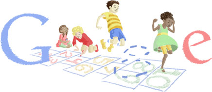
But the consequence of all this feel-good business is that design has become, more often than not, a badge of mediocrity. The old Modernist dream of good design standing for rationality and human values has been flipped. Today, good design is little more than a cosmetic agent, an obscuring agent. When I see my favorite sandwich bar introduce a slick new fascia and smart window decals, a little wave of disappointment runs through me. You don't see the work of sign writers any more; it's hard to find handmade signs and ramshackle window displays. The urban environment is now over-designed. It's all too branded, too inhuman. "
O artigo do Design Observatory de onde retirei esta citação tem uns aninhos [ 03.12.06, Google and the Tyranny of Good Design] mas acho que é uma boa reflexão sobre um mundo demasiado projectado que pode afastar-nos por ser desumano. Projectar para as pessoas e não pelo "dzgn-erish" da coisa, aceitar que podemos não ter de controlar tão friamente tudo, para que exista participação e envolvimento.
But the consequence of all this feel-good business is that design has become, more often than not, a badge of mediocrity. The old Modernist dream of good design standing for rationality and human values has been flipped. Today, good design is little more than a cosmetic agent, an obscuring agent. When I see my favorite sandwich bar introduce a slick new fascia and smart window decals, a little wave of disappointment runs through me. You don't see the work of sign writers any more; it's hard to find handmade signs and ramshackle window displays. The urban environment is now over-designed. It's all too branded, too inhuman. "
O artigo do Design Observatory de onde retirei esta citação tem uns aninhos [ 03.12.06, Google and the Tyranny of Good Design] mas acho que é uma boa reflexão sobre um mundo demasiado projectado que pode afastar-nos por ser desumano. Projectar para as pessoas e não pelo "dzgn-erish" da coisa, aceitar que podemos não ter de controlar tão friamente tudo, para que exista participação e envolvimento.
segunda-feira, 17 de janeiro de 2011
Visit Nordkyn

http://www.underconsideration.com/brandnew/archives/where_the_cold_wind_blows.php
The visual identity is based on two main ingredients; our newly developed payoff, “Where nature rules,” and weather statistics from the Norwegian Meteorological Institute. A feed of weather statistics affects the logo to change when the direction of the wind or the temperature changes. On the website, the logo updates every five minutes. We developed a logo generator where Visit Nordkyn can download their logo to the exact weather conditions of that particular moment. Nordkyn is truly a place where nature rules, even over the visual identity.
Neue Project Description
Proposta de trabalho 3.2
O enunciado da proposta de trabalho 3.2 iniciada na semana passada já se encontra online.
http://designdois.blogspot.com/p/propostas-de-trabalho.html
http://designdois.blogspot.com/p/propostas-de-trabalho.html
Manual de identidade da UP
O manual de identidade da Universidade do Porto encontrado pela vossa colega Carla Serra.
http://hestia.up.pt/manualUP/index.php.
http://hestia.up.pt/manualUP/index.php.
segunda-feira, 10 de janeiro de 2011
Change +: Leslie Witt, “The Illusion of Neutrality”
"In design there is no neutrality. You're either help to create the problem or contributing to the solution."
Change +: Leslie Witt, “The Illusion of Neutrality” from IDEO on Vimeo.
"As credit cards are increasingly vilified - treated as a disease, demanding abstention - the question must be asked - ‘how did something so neutral become so polarized?’. We believe that it’s this neutrality, or illusion of neutrality, which is at the heart of the problem. The illusion of neutrality and the lack of personal control which is it’s bedfellow, isn’t unique to credit cards, nor to the financial service industry. From big box retailers who see themselves as simply the bridge from supplier to purchaser, to utility companies who envision their service as one of pipes and nodes - a sense of identity as infrastructure allows industries to avoid implication in the range of unhealthy and unsustainable behaviors that permeate our now. You can’t be Switzerland in this battle, and it’s important to pick which side you’re on. Design can help you step out of the shadow of neutrality and tread into the choppy waters of behavior change."
Change +: Leslie Witt, “The Illusion of Neutrality” from IDEO on Vimeo.
"As credit cards are increasingly vilified - treated as a disease, demanding abstention - the question must be asked - ‘how did something so neutral become so polarized?’. We believe that it’s this neutrality, or illusion of neutrality, which is at the heart of the problem. The illusion of neutrality and the lack of personal control which is it’s bedfellow, isn’t unique to credit cards, nor to the financial service industry. From big box retailers who see themselves as simply the bridge from supplier to purchaser, to utility companies who envision their service as one of pipes and nodes - a sense of identity as infrastructure allows industries to avoid implication in the range of unhealthy and unsustainable behaviors that permeate our now. You can’t be Switzerland in this battle, and it’s important to pick which side you’re on. Design can help you step out of the shadow of neutrality and tread into the choppy waters of behavior change."
domingo, 9 de janeiro de 2011
Brands of the future
"As brands become less the property of an organisation and more the banner of a movement, ownership will become even looser. Logos will be things other organisations, and individuals, can borrow and adapt."
http://www.wolffolins.com/brandnext/
http://www.wolffolins.com/brandnext/
sexta-feira, 7 de janeiro de 2011
("I COOK FOR YOU") - a nova panela de pressão do design

—desculpem a quantidade de texto, mas leiam—
"(…)The balancing of understanding and overbearing clients is nothing new, but at least that client/designer relationship still exists. Only a few months ago a new service Ready Media pitched up online, which allows companies to create their own magazines using a set of pre-designed templates. This is something that has existed for a long time for websites, but relatively new to editorial publishing. Opening with the inflammatory phrase ‘just add content’, it conjures up images of picking out a packet of cake mix, and simply adding water, stirring, and throwing it in the oven. It may be standard practice for design agencies to create templates for new or relaunched magazines, and then passed onto the in-house art department, but these templates are built for that particular magazine; its audience, its content, the art direction and the flow of the articles. The danger of removing the designer from the process and allowing the client to directly pick out a pre-designed template is it may not suit the content or audience. Ready Media does offer to adapt templates for an extra fee, so as a business idea it’s perfect for getting clients through the door and selling them something more ‘bespoke’. However, it causes many designers, including myself, to feel quite uncomfortable. It makes our job appear easy, like simply picking out a new set of curtains, our only function is mere decoration. It devalues the role that the designer plays in the process.
If the template services are widely adopted by the industry, it may only be bad news for designers that use the same style over and over again for each client. Inevitably they will be imitated or absorbed by the companies offering a template of a similar style at a fraction of the price. This will force some designers to try harder, to outrun the imitators. My concern is the designer becomes an expensive luxury that can be removed from the formula. This may not worry the agencies with large clients with large pockets, but for the companies that rely on a steady flow of lower budget work this could seriously affect their survival.
The template model may cause editorial designers to shift uneasily in their seats, but branding designers may also worry a little about the outsourcing/crowdsourcing model made possible by faster and wider global internet access. Some companies offer an ‘affordable’ and speedy logo outsourced to countries where the labour is cheaper. Others offer the crowdsourcing model, where a cluster of desperate enthusiastic designers spit out many variations of the client’s logo, until a lucky one wins the measly prize. Essentially this is a marriage of convenience; the client will get exactly what they pay for; an ill-conceived design, based on a sparse brief and no expensive surprises, and the designer gets paid for a few hours work. Everyone’s a winner.
The budget logo companies draw inevitable comparisons with the fashion industry. From employing cheap overseas labour for the benefit of rich Western countries, to the cheap but formulaic styles that spread like wildfire. Budget high street fashion stores are regularly ‘inspired’ by the designs that appear on the high fashion catwalks, with the budget logo designers they too absorb the styles of the designers at the top.
To survive as a designer (without losing your soul) does that mean we have to become the equivalent of a Saville Row tailors? Essentially yes, with a tailor you pay for the personalised customer service, for an outfit that not only fits and flatters you, it fits your personality. So as designers we have to maintain that level of service, listening to the client, creating something unique to them and risk surprising them with something they were not expecting. All of these qualities are impossible to conduct with a quick and cheap logo service, or a window display of templates. For the client who appreciates these differences, they be willing to pay the extra to communicate their message and personality effectively."
será que isto é considerado design, ou algo que podemos comprar no supermercado?
quarta-feira, 5 de janeiro de 2011
"Less, but better", Dieter Rams e a Apple
"Pablo Picasso once said Good Artists Copy, Great Artists Steal then Steve Jobs mention that in one interview long ago. We all know that Apple products are the best out there, there's no doubt about it, and the main reason about that is because they have the best design.
Jonhathan Ive, the chief industrial designer at Apple is a fantastic designer but it's always good to know what and who inspired him to come up with the Apple product designs. We might think that they are pretty unique and new but when we look at Dieter Rams the Pablo Picasso's quote makes even more sense."

Rams' ten principles to "good design"
- is innovative
- makes a product useful
- is aesthetic
- makes a product understandable
- is unobtrusive
- is honest
- is long-lasting
- is thorough down to the last detail
- is environmentally friendly
- is as little design as possible
mais aqui: http://abduzeedo.com/design-history-diert-rams-less-better
Subscrever:
Mensagens (Atom)