sexta-feira, 18 de março de 2011

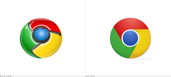
The end of web 2.0 logos?


"It’s certainly nice and welcome to move away from logos that looked as if they came out of a mash-up of Fisher-Price and Tron and the new “abstract,” flat logos are slightly slicker but there is still something odd about them. (...)Maybe I’m just misinterpreting what I’m seeing or trying to extract too much sense out of it — indeed, I’m just glad for the move towards simplicity."


- o artigo completo no Brand New

quarta-feira, 16 de março de 2011

Augmented Reality Get Its Own Standardized Logo


"With the new AR+ logo, the industry can give consumers, developers, brands, and others a consistent framework for encountering and understanding augmented reality solutions," said Uzzan in a press release Thursday. "There's a sense that the AR industry has grown up too fast, that it has at times felt like the 'Wild West.' Today, the industry consists of multiple players, multiple platforms and easier access to AR. The new AR+ logo affirms that we're working with a new human interface, now going mainstream."

More  at http://www.readwriteweb.com/archives/augmented_reality_gets_its_own_standardized_logo.php

domingo, 13 de março de 2011

SALZIG - Sporthocker -- ispo BrandNew Awards


E fica aqui um outro que não está relacionado com identidade.
É um desporto criado por designers!

Volkswagen Commercial: The Force


Fica aqui um anúncio dos mais engraçados que já vi!

Building Brand Value Through the Strategic Use of Sound

Most organizations have relied almost exclusively on the sense of sight to communicate who they are, what they do and why they matter. Pirates have their unmistakable skull-and-bones flag. Nearly all religions have their own unique symbol. And today, practically every brand on earth has its own visual identity. Other senses are rarely part of the equation.

Yet sound has unquestionable potential in creating impressions. Consider the sonic snippets in your life—imagine Chariots of Fire or Rocky without music, a PC commercial without that Intel Inside bongggg, or a Harley-Davidson hog without its expertly calibrated tone. Sound triggers recall and reactions. And much like good visual or industrial design, it also has the ability to convey value and strengthen brand reputations.

Forward-thinking brands are catching on. In this first of a two-part series based on my co-presentation at the “Gain” conference last October, we introduce the practice of audio branding and identity – the intentional use of music, sound and voice to create a connection between people and organizations. And in part two, we will dig deeper with a real-world, case-study look at the recently created audio identity for Sun Microsystems and its ubiquitous Java brand.

Continues at http://www.aiga.org/content.cfm/building-brand-value-through-sound
A short course in audio branding

"The graphics in this six and a half minute video aren’t great, but if you’re interested in branding, the subject matter should be (audio branding). Uploaded to YouTube a year ago, the video has racked-up just 4,000 views. I think it’s worth spreading a little further."

“Sound branding (also known as audio branding, sonic branding, acoustic branding, or sonic mnemonics) is the use of sound to reinforce brand identity. Sound branding is increasingly becoming a vehicle for conveying a memorable message to targeted consumers, taking advantage of the powerful memory sense of sound.”


More at http://www.davidairey.com/audio-branding/

quinta-feira, 10 de março de 2011

ITI


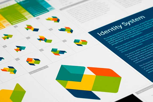
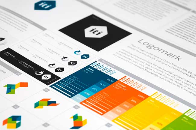
ITI is a pioneer in automation technology, solving everyday challenges in all parts of life. With a clear strategic focus, ITI is making better life-quality everywhere — in private life, corporate buildings, public space and healthcare. The brand communication Heydays developed for ITI is built upon the business idea itself. Making everyday tasks easier for everyone, ITI’s visual program is summarized in the slogan “Room for life.”

The logo can be seen as just a flat artwork, but can also be seen as a cube felt with colors. The multicolored supporting graphic illustrates the logo folded out, and comes in a number of different versions. This communicates both the adaptability of the system, and life taking different directions. Appearing different on every surface, the visual expression is a representation of life, freedom and possibilities. The color palette is optimistic and brings energy to the brand. Heydays established their core values and developed a full visual identity program and slogan.

More at http://identitydesigned.com/iti/


ITI from Heydays on Vimeo.


Ler mais aqui.

quarta-feira, 9 de março de 2011

sexta-feira, 4 de março de 2011

Hi: A real human interface


Hi from Multitouch Barcelona on Vimeo.


Hi, behind the scenes. from Multitouch Barcelona on Vimeo.

Vimeo Awards

Capture (a propósito de exploração tridimensional).


Animation


Motion Graphics.


More at http://vimeo.com/awards/

quinta-feira, 3 de março de 2011

a propósito da animação...


"Artv ask Montreal based artists to represent the logo of their channel in the way they want. I used around 15 pieces of plywood with a mirror on the backside to create the shape of the Artv logo, a Canadian television channel. 

The shot was made on the roof of a building downtown Montreal. We used a smoke machine and a projector to create the reflections of lights and colours during the shoot. 

Concept & Art : Julien Vallée
Director + Animator : Gabriel Poirier-Galarneau
Photographer : Sylvain Dumais
Sound : Jean-Sébastien Proulx
Client : Artv
Agency : Toxa

Making of & details : jvallee.com"


quarta-feira, 2 de março de 2011

kerning game?

KERN iPhone game demo from Jason Franzen on Vimeo.


Celebração 20 anos Público

O público faz 20 anos, e sendo eu leitor habitual da edição online, fui reparando que nos ultimos dias os logos têm mudado regularmente.

Acabo de saber que o Público pediu a vários designers e artistas para redesenhar o seu logo. Há uns bastante "legais".

Toca a seguir.

20 ANOS PÚBLICO